If you’re diving into the world of Joomla, you’re in for a treat! This platform is not just about functionality; it’s a canvas for creativity. With design trends evolving rapidly, keeping up can feel like trying to catch a moving train. But don’t worry! We’ve got your back. In this article, we’ll explore the latest trends that can elevate your Joomla projects from ordinary to extraordinary.
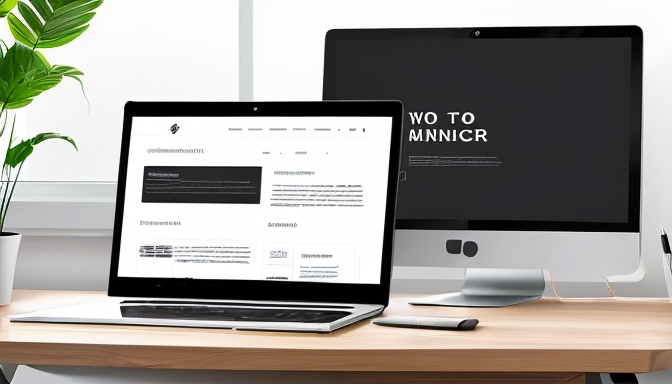
First up, let’s talk about responsive design principles. In today’s mobile-first world, having a website that adapts seamlessly to any device is crucial. Imagine visiting a site on your phone and having to zoom in and out just to read the text! Frustrating, right? Joomla templates that embrace responsive design ensure that your content looks stunning, whether it’s on a desktop, tablet, or smartphone. This adaptability not only enhances user experience but also boosts your SEO rankings, making it a win-win situation.
Next, we can’t ignore the power of minimalism in Joomla themes. Less is often more, and this design philosophy is all about stripping away the unnecessary to focus on what truly matters: your content. A minimalist approach creates a clean, visually appealing interface that invites users to engage without distraction. Think of it as decluttering your digital space, allowing the essence of your message to shine through.
So, are you ready to embrace these trends? Stay tuned as we delve deeper into each topic, ensuring your Joomla site not only looks amazing but performs exceptionally well!
Responsive Design Principles
In today’s digital landscape, responsive design is not just a trend; it’s a necessity. Imagine visiting a website on your phone, only to find that the text is tiny and the images are cut off. Frustrating, right? That’s why Joomla templates must be adaptable, ensuring that your site looks stunning and functions seamlessly on any device—be it a smartphone, tablet, or desktop.
One of the key principles of responsive design is fluid grids. This approach allows your layout to adjust dynamically based on the screen size, ensuring that content is always presented in an organized manner. Instead of fixed dimensions, consider using percentages for widths. For example, a two-column layout on a desktop can transform into a single-column view on mobile, enhancing readability.
Another vital aspect is media queries. These are CSS techniques that apply different styles based on the device characteristics. By using media queries, you can change font sizes, image dimensions, and even layout structure to cater to various screen sizes. It’s like having a chameleon that changes to suit its environment!
Finally, don’t forget about touch-friendly design. With more users navigating sites via touchscreens, ensuring buttons and links are adequately sized for easy tapping is crucial. A good rule of thumb is to make sure interactive elements are at least 44 pixels in height and width. This way, you’ll keep your users happy and engaged.
In conclusion, embracing responsive design principles in your Joomla projects will not only elevate the aesthetic appeal but also significantly enhance user experience. So, why not start optimizing your site today?
Minimalism in Joomla Themes
In the ever-evolving world of web design, minimalism stands out as a powerful trend, especially for Joomla themes. Think about it: when you walk into a room that’s cluttered, it feels overwhelming, right? Now, imagine stepping into a space that’s clean and organized—suddenly, you can breathe easier and focus better. That’s the essence of minimalism in web design. It’s all about stripping away the unnecessary and letting your content shine.
Joomla themes that embrace minimalism prioritize functionality and user experience. By using simple layouts, ample white space, and a limited color palette, these designs create a visually appealing interface that guides users effortlessly through your content. Imagine your website as a well-curated gallery where each piece of art (or content) can be appreciated without distraction. Here are a few key elements that define minimalistic Joomla themes:
- Clean Lines: Smooth edges and straightforward shapes help to create a sense of order.
- Neutral Colors: Soft tones allow for a calm browsing experience, letting images and text pop.
- Focus on Typography: Using bold, clear fonts can effectively convey your message without the need for additional graphics.
By adopting minimalistic principles, you not only enhance the aesthetic appeal of your Joomla site but also improve its functionality. Users can navigate easily, find information quickly, and enjoy a seamless experience. So, if you’re looking to elevate your Joomla projects, consider going minimalist—it’s a decision that could lead to stunning results!
Frequently Asked Questions
- What is responsive design in Joomla?
Responsive design in Joomla refers to the ability of your website to adapt seamlessly to different devices and screen sizes. It ensures that your site looks great and functions well, whether viewed on a desktop, tablet, or smartphone. Think of it as a chameleon that changes its colors to fit its environment!
- Why is minimalism important in Joomla themes?
Minimalism is all about keeping things simple and clean. In Joomla themes, this means prioritizing essential content and functionality without overwhelming users with clutter. A minimalist design can improve user experience, making it easier for visitors to find what they need—like a well-organized closet where everything is easy to find!
- How can I implement these design trends in my Joomla site?
Implementing these design trends is easier than you think! Start by choosing a responsive Joomla template that embraces minimalist principles. Customize it to reflect your brand while focusing on user experience. Don’t forget to test your site on various devices to ensure it looks and performs beautifully everywhere!